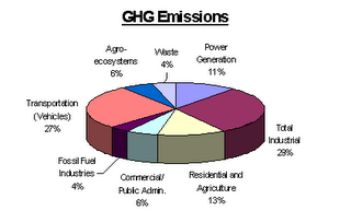
 Since California is targeting GHG (greenhouse gas) emission, let's look at those! If you're curious about NOx, SOx, VOCs, or PM emissions, all of which are associated with mortality as well as cardiovascular and respiratory illness - you can find more pie charts here. This image is for Ontario, by the way; the divisions would be quite a bit different in other countries, especially developing nations.
The writing on this figure is very tiny, so let me enlighten us all. We have:
Total Industrial: 29%
Transportation: 27%
Residential and Agriculture: 13%
Power Generation: 11%
Agr0-ecosystems: 6%
Commercial/ Public Admin: 6%
Fossil Fuel Industries : 4%
Waste: 4%
Transportation: 27%
Residential and Agriculture: 13%
Power Generation: 11%
Agr0-ecosystems: 6%
Commercial/ Public Admin: 6%
Fossil Fuel Industries : 4%
Waste: 4%
The source for this by the way is 1999 data collected by Natural Resources Canada
I think that one of the reasons we focus on cars is that we as individuals can make an immediate decision to change the way we use them, whereas industrial and power generation emissions often seem a bit more distal. Also, because so many personal vehicles are big and shiny and use a lot of gas, cars are emblematic of our (and I mean mainly North Americans by "our", for the time being anyway) consumerist, materialist lifestyle. Cars are everywhere - so they are a very visible symbol of our societal willingness to place immediate convenience above the less obvious possibility of global warming.
It's also the easiest way of penetrating the community consiousness, I think. It's easier for people to associate emissions from the tailpipe - which they can feel, or see - with having an impact than it is for them to realize that running the air conditioner causes tons of emissions at some power generation facility several km away.
Even more distal: industrial emissions - which are a big source of GHG. Which products sitting on my desk are associated with emissions? Which industries do I benefit from on a regular basis? This takes some thought.
No comments:
Post a Comment